Decor Home and Garden

Decorating, plants and landscaping ideas for every home

Category: Colors, Styles & Lighting

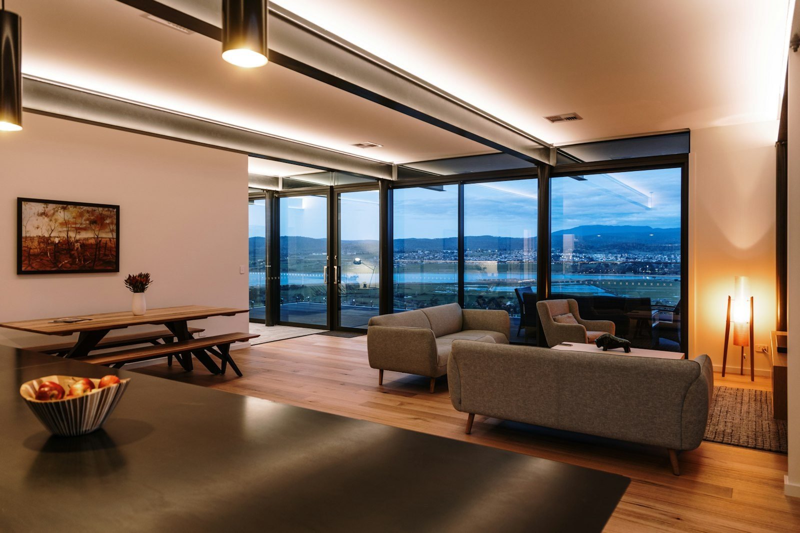
Color, style and light change how a room feels more than almost anything else, often for less than the cost of new furniture. In this category we bring together guides to choosing palettes, understanding the main interior design styles and planning the lighting in your home. Each guide uses practical examples you can adapt to any space, from a simple refresh to a full room makeover.

In our living room color ideas guide, you will see how to combine shades on walls, furniture and fabrics, and how natural light changes the way each color looks. If you are still deciding which direction to take, the article on interior design styles covers the most popular ones and helps you figure out what suits you and your routine.

Lighting completes the picture: the home lighting design guide explains ambient, task and accent lighting, color temperature and color rendering index (CRI), room by room. For any change to your electrical wiring, we recommend hiring a licensed electrician.

  • Living Room Color Ideas: Palettes and Combinations That Work

    Living Room Color Ideas: Palettes and Combinations That Work

    When you’re redecorating or moving, sorting through living room color ideas is often the step that causes the most second-guessing. The living room is the most visible space in the home: it’s where you welcome guests, unwind and, quite often, work or share meals. A well-chosen color makes the room feel warm and cohesive; the wrong one can start to wear on your eyes within a few weeks.

    The good news: there’s no mystery to it. With a few simple principles, tried-and-true palettes and a proper test before you paint, you can get it right without relying on luck. In this guide, we’ve gathered combinations that work, smart moves for small living rooms and specific suggestions for the TV room.

    How color changes the way a living room feels

    Before thinking about trendy shades, it helps to understand the effect each color family has. Broadly speaking:

    • Warm colors (terracotta, mustard, brick red, dusty rose) make surfaces feel closer and the space cozier. They work well in large living rooms or in rooms that feel a little flat.
    • Cool colors (blues, greens, grayish lilacs) bring a sense of calm and seem to push the walls back, which helps in smaller spaces.
    • Neutrals (off-white, sand, gray, greige, taupe) are the most versatile base and get along with almost any furniture or style.

    Light changes everything. A living room that gets plenty of sun can handle deeper shades without feeling heavy, while a room with little natural light calls for light colors with a slightly warm undertone so it doesn’t look dull. Your light bulbs play a part too: warm, yellowish light brings out warm tones, while cool white light emphasizes blues and grays.

    The 60-30-10 rule for building your palette

    A proportion widely used by decorators helps balance the colors in a room. It isn’t a law, but it prevents excess:

    1. 60% — base color: walls, floor and a large rug. Usually a neutral or a soft shade.
    2. 30% — supporting color: the sofa, curtains, an accent wall or built-in cabinetry.
    3. 10% — accent color: throw pillows, artwork, vases, an armchair or a table lamp.

    In practice, the rule helps you decide where your boldest color should go. If you love emerald green, for example, use it in the 30% (a sofa) or the 10% (pillows and accessories) and keep everything else calmer.

    Living room color palettes and combinations

    The table below lists six reliable combinations, with suggestions for where to use each color. Treat it as a starting point and adjust it to what you already own.

    Palette Base (60%) Supporting (30%) Accent (10%) Mood
    Warm neutrals Off-white or sand Wood and caramel leather Olive green Welcoming and timeless
    Green and terracotta Soft white Sage green Terracotta and brass Natural and airy
    Blue and yellow Icy white Deep teal Mustard Cheerful and bold
    Gray and pink Light gray Dusty rose Black and gold Delicate and urban
    Monochrome blue Very pale blue Mid blue Navy blue Serene and sophisticated
    Deep earth tones Pinkish beige Coffee brown Rust and natural linen Intimate
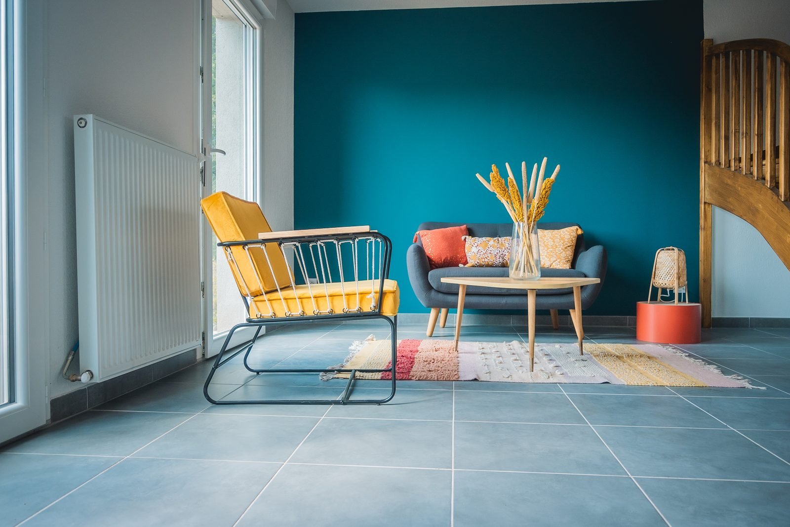
    Living room with a deep teal wall, blue sofa, mustard armchair and colorful rug
    Deep teal and mustard: a complementary pairing full of personality. Image: wirestock / Freepik

    If you’d rather create your own palette, the color wheel is your best friend. There are three main approaches.

    Analogous colors

    These sit next to each other on the wheel, such as green, blue-green and blue, or yellow, orange and terracotta. The result is harmonious and restful, ideal if you want color without harsh contrast.

    Complementary colors

    These are opposites: blue and orange, green and pink, purple and yellow. They create energy and contrast. The secret is balance: one color dominates and the other shows up in small touches. Muted versions, such as deep teal with mustard, are easier to live with than pure, saturated ones.

    Monochromatic palette

    This approach uses a single color in several intensities. It’s an elegant choice that works especially well with varied textures (linen, velvet, wood, natural fibers) so the room doesn’t feel monotonous. To see how each palette relates to your furniture’s style, see our guide to interior design styles.

    Colors for a small living room

    In compact spaces, color is a tool for making the room look bigger. A few strategies that work:

    • Choose light, slightly cool tones for the walls: icy white, pearl gray, soft aqua and grayish blue reflect more light.
    • Paint the walls and ceiling the same color (or the ceiling one shade lighter): this blurs the edges and makes the ceiling look higher.
    • Put the color in the furniture: a green or terracotta sofa adds personality without closing in the space.
    • Avoid too many strong contrasts: walls broken up by several colors fragment the room and make it look smaller.
    • Use a back wall: a mid-tone on the wall farthest from the entrance creates a sense of depth.

    Dark colors aren’t off-limits in small living rooms. With good lighting, moss green or navy blue on every wall can create an enveloping, almost cocooning effect. What doesn’t work is a dark color in a room with no natural light and little artificial lighting. For layout and furniture tips, see our article on small living room ideas.
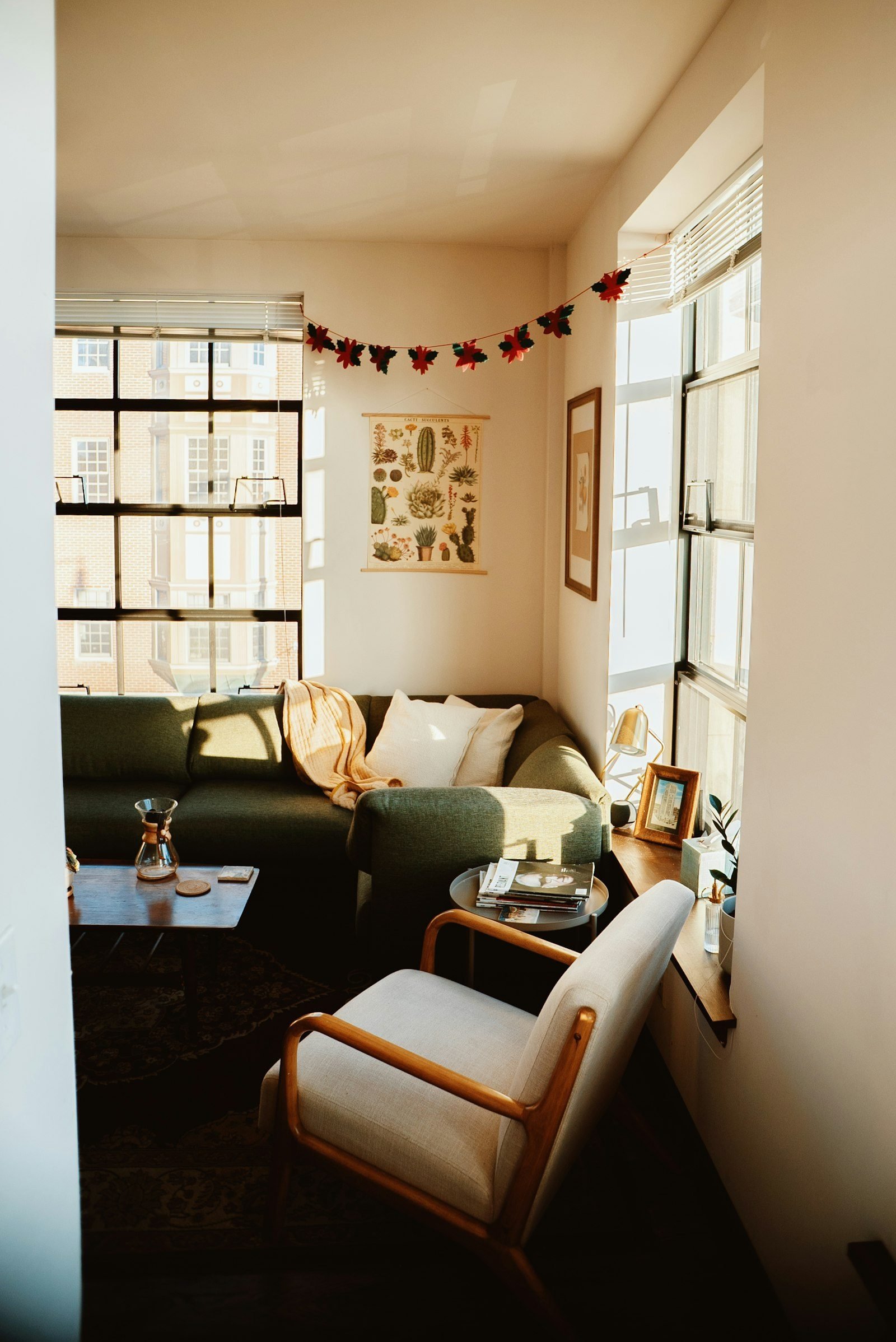
    Small living room with cream walls, a dark green sofa, a light wooden armchair and large windows
    Light walls with the color concentrated on the sofa: a smart strategy for compact living rooms. Photo: Evan Wise / Unsplash

    Colors for a TV room

    When the living room is mainly used for watching movies and shows, the focus shifts: the goal is visual comfort and fewer distractions.

    • A mid-tone or dark TV wall: charcoal, deep teal, moss green or brown help disguise the black screen when the TV is off and make the picture stand out.
    • A matte finish: satin or glossy paints reflect light from lamps and windows toward the screen.
    • Warm colors in the textiles: throws, pillows and rugs in caramel, burgundy or mustard balance cooler walls and make the room inviting.
    • Wood paneling as an alternative: a slatted or flat wood panel adds color and texture without requiring dark paint.

    Wall color works hand in hand with lighting. Indirect light behind or beside the TV and warm-toned bulbs make the room more comfortable at night. We cover this in detail in our guide to home lighting design.
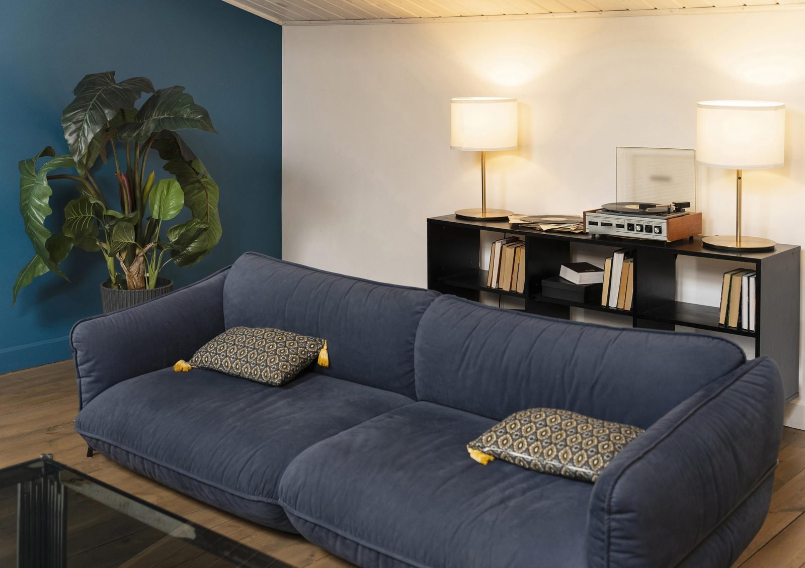
    Living room with a deep teal wall, navy sofa, black bookcase filled with books and lit table lamps
    Deep blues and warm light set the right mood for relaxing. Image: magnific / Freepik

    Checklist: how to test a color before you paint

    The same paint can look completely different in the brochure, at the store and on your wall. Before you buy gallons of it, run through this checklist:

    • Paint large swatches (at least 8.5 x 11 in / 21 x 30 cm) or use peel-and-stick samples.
    • Place the samples on different walls, including the one that gets the least light.
    • Check them in the morning, afternoon and evening, under the bulbs you actually use.
    • Compare the color with the floor, the sofa and your wood furniture, which won’t change.
    • Choose the finish: matte hides imperfections; satin is easier to clean.
    • Go for washable paint in homes with kids or pets.
    • Calculate the wall area and buy a little extra from the same batch for touch-ups.

    A note from someone who follows the real estate market: if you plan to sell or rent out your home in the next few years, a neutral base on the walls, with color in accessories and textiles, makes life easier. Visitors can picture their own furniture in the space, and repainting becomes optional rather than a must.

    Frequently asked questions

    What is the best color for a living room?

    There’s no single answer, but warm neutrals such as off-white, sand and greige are the most versatile, because they go with almost any furniture and let you change the accent colors over time.

    Can I use a dark color in a small living room?

    Yes, as long as the room is well lit, whether by natural or artificial light. A safer alternative is to use the dark shade on a single wall or on the cabinetry and keep the rest light.

    How many colors should I use in a living room?

    Three main colors are usually enough: a base, a supporting color and an accent, following the 60-30-10 proportion. Shades of the same color and natural wood don’t count as extra colors.

    What wall color goes with a gray sofa?

    A gray sofa is wonderfully easygoing. It looks great with white or sand walls for a light feel, with sage green or grayish blue for a serene mood, and with terracotta or mustard accents to warm things up.

    Conclusion

    Turning living room color ideas into a finished room is more about method than talent: understand the room’s light, set the proportion between base, supporting and accent colors, and test before you paint. Which palette suits your home best? Tell us in the comments, and don’t miss our guide on how to find your interior design style.

    Featured image: Photo: Kara Eads / Unsplash
  • Interior Design Styles: The Main Ones and How to Find Yours

    Interior Design Styles: The Main Ones and How to Find Yours

    Getting to know the main interior design styles is the most efficient shortcut to a cohesive home. Once you understand what defines each look, it becomes much easier to choose furniture, colors and accessories without that nagging feeling that nothing quite goes together. It also helps you explain what you want to an architect, interior designer or cabinetmaker.

    In this guide, we’ve gathered the styles you’ll see most often in homes today, explained how to recognize each one by its materials, shapes and palette, and laid out a simple step-by-step process to discover which one suits you and the way you live.

    Clean-lined styles: modern, contemporary and minimalist

    These three are often confused, because they share a preference for simple shapes and very little ornamentation. The differences are in the details.

    Modern

    Rooted in the 20th-century modernist movement, modern style prizes function: straight lines, furniture with visible legs, materials such as wood, leather, glass and metal, and a neutral palette with touches of primary color. The core idea is that form follows function.

    Contemporary

    This is the style of the present moment, so it keeps changing over time. Today it blends warm neutrals, soft curves, textured fabrics such as bouclé and linen, built-in lighting and the occasional statement design piece. It’s the most versatile of the three and the one you’ll see most often in new apartments.

    Minimalist

    Minimalism takes simplicity to the limit: few objects, clear surfaces, hidden storage and a pared-back palette, usually white, gray, black and wood. It requires discipline, because any excess stands out immediately, but it rewards you with a calm home that’s easy to clean.

    Cozy styles: Scandinavian, japandi and rustic

    Scandinavian

    Scandinavian style was born in countries with long, dark winters, which explains its obsession with light: white or pale gray walls, light woods, natural fabrics, soft throws, plants and functional furniture. It’s simple without being cold, and that’s why it has won over so many people.

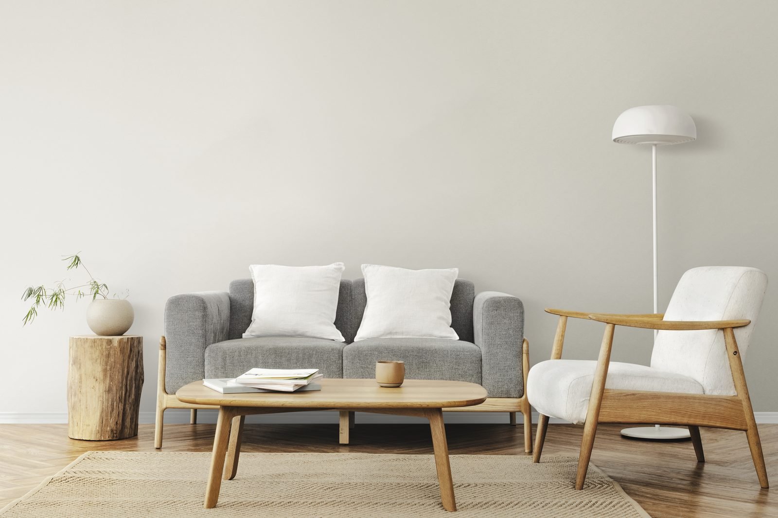
    Scandinavian living room with a gray sofa, white pillows, a light wood coffee table and armchair, and a natural-fiber rug
    Light wood, gray and white: the foundation of Scandinavian style. Image: rawpixel.com / Freepik

    Japandi

    Japandi is a fusion of Japanese and Scandinavian aesthetics. From the Japanese side come low furniture, darker woods, handmade ceramics and an appreciation for imperfection; from the Nordic side, comfort and functionality. The palette is earthy and soft, with beige, sand, olive green and small doses of black.

    Rustic

    Rustic style relies on materials with a raw or weathered look: reclaimed wood, stone, brick, iron, basketry and heavy fabrics. It can have a country-house or farmhouse feel and, in today’s versions, it looks lighter, paired with pale walls and contemporary pieces (often called modern rustic).

    Styles with personality: industrial, boho and retro

    Industrial

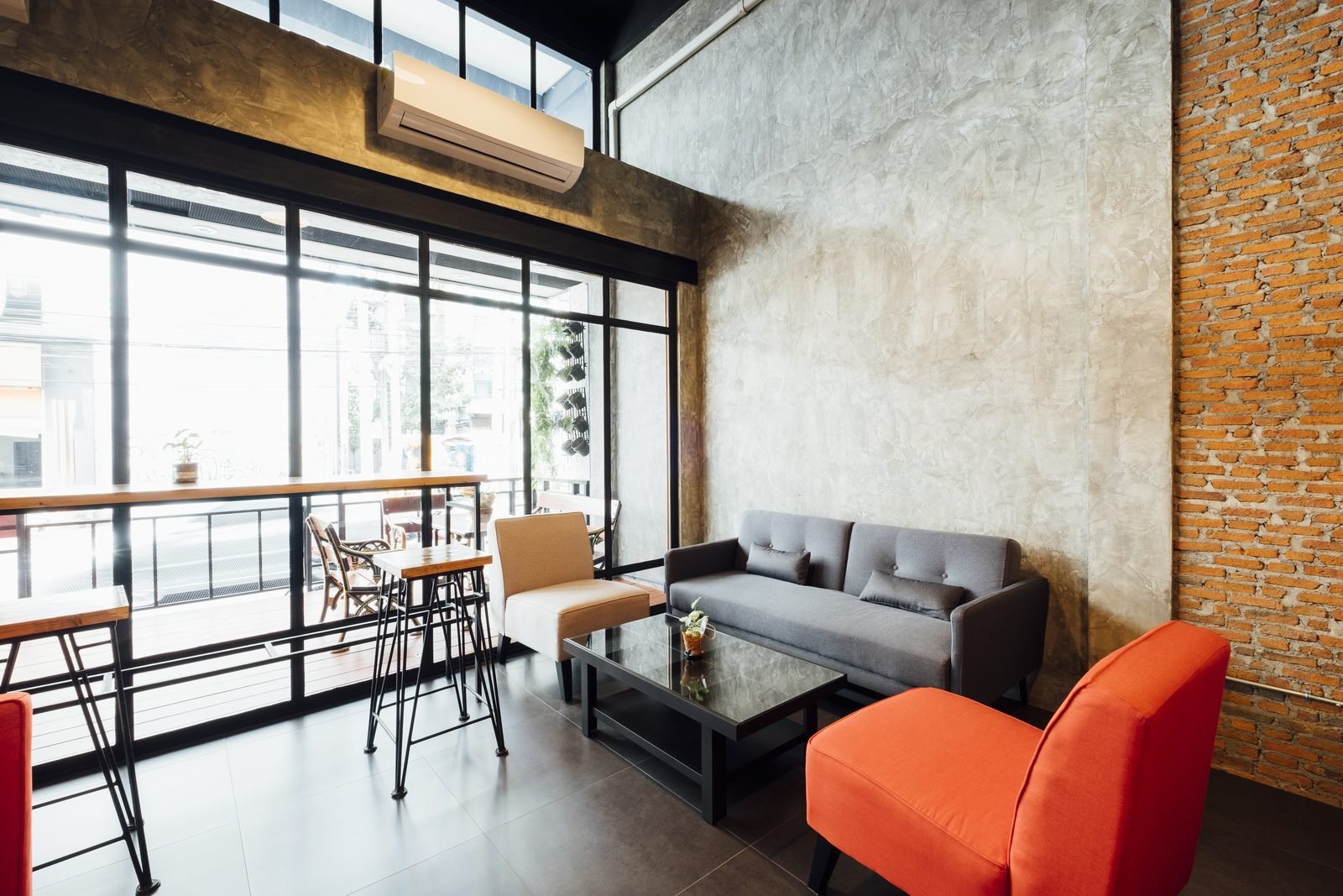
    Inspired by old warehouses and factories converted into homes, industrial style celebrates what usually stays hidden: exposed concrete, bare brick, visible pipes, black metal window frames and factory-style light fixtures. To keep it from feeling heavy, balance it with wood, rugs and a bold color, like the orange armchair in the photo below. In apartments without an exposed structure, you can get the effect with concrete-look or brick-look wall finishes, track lighting and cabinetry with metalwork details.

    Industrial-style space with a polished concrete wall, exposed brick, black window frames, a gray sofa and an orange armchair
    Concrete, brick and black metal, warmed up by an orange armchair. Image: jcomp / Freepik

    Boho

    Short for bohemian, boho is free-spirited and deeply personal. It mixes natural fibers (straw, rattan, jute), macramé, patterned rugs, lots of plants, layered pillows and objects from travels or handmade crafts. The palette tends to be earthy, with touches of terracotta, mustard and green. The lighter version, full of beige and straw, is known as boho chic.

    Retro and mid-century modern

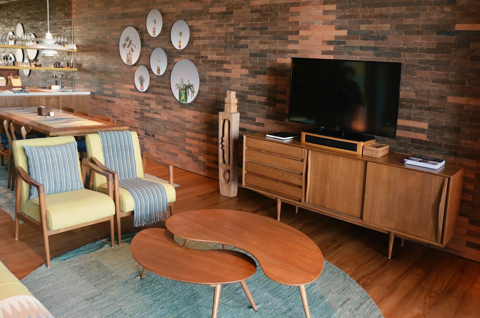
    Retro revisits references from past decades, while mid-century modern draws specifically on design from the middle of the 20th century. The easiest signs to spot are slim tapered legs, organic shapes (such as the kidney-shaped coffee table), low dark-wood sideboards and colors like mustard, olive green, orange and deep teal.

    Mid-century living room with yellow wooden armchairs, organic-shaped coffee tables, a low sideboard and a brick wall
    Tapered legs, an organic table and a low sideboard: the mid-century signature. Photo: Phebe Tan / Unsplash

    Classic and neoclassical: timeless elegance

    Classic style draws on traditional European references: symmetry, decorative wall moldings (boiserie), chandeliers, mirrors with ornate frames, luxurious fabrics such as velvet and silk, and carved furniture. The palette ranges from white and cream to gold, deep green and blue.

    Neoclassical is the updated version and the more common of the two today: it keeps the boiserie, the symmetry and the sophistication, but with cleaner-lined furniture, less ornamentation and a light palette. It works well in apartments with high ceilings and for anyone who likes an elegant feel without going overboard. A simple way to test the style is to add moldings to a single wall, such as the one behind the bed or the sofa, before investing in furniture.

    Interior design styles at a glance

    Use the table to recognize a style at first sight or to check whether the pieces you plan to buy belong to the same family.

    Style Colors Materials Telltale piece
    Contemporary Warm neutrals Bouclé, linen, wood, stone Curved sofa
    Minimalist White, gray, black Lacquer, plain wood Empty surfaces
    Scandinavian White, pale gray Light wood, wool, cotton Light wood chair
    Japandi Beige, sand, black Wood, ceramics, paper Low furniture
    Rustic Earth tones Reclaimed wood, stone Solid wood table
    Industrial Gray, black, rust Concrete, metal, brick Factory-style light fixture
    Boho Terracotta, mustard, beige Straw, rattan, macramé Wall tapestry
    Mid-century Mustard, olive, orange Dark wood, leather Tapered legs
    Classic Cream, gold Velvet, marble, carvings Boiserie and chandelier

    How to identify your interior design style

    Few people fit neatly into a single style, and that’s perfectly fine. The goal is to find a main direction. Follow this checklist:

    1. Create a mood board: save 20 to 30 images of rooms you like, without overthinking it. Then look for what repeats: colors, woods, shapes and how many objects are on display.
    2. Look at what you already own: the pieces you love most usually reveal your taste better than any online quiz.
    3. Answer a few quick questions: do you prefer full rooms or sparse ones? Light wood or dark? Black metal or gold? Solid colors or patterns?
    4. Consider your routine: with kids and pets, delicate fabrics and lots of objects on display mean more work. If you have little time for cleaning, you’ll probably get along better with pared-back styles.
    5. Respect the home itself: the architecture, the natural light and the size of the rooms all play a part. A compact apartment calls for lighter styles; see our tips on small apartment decorating.
    6. Choose a main style and a secondary one: a split of roughly 80/20 keeps your home from turning into a collage.

    Can you mix styles?

    Yes, and the most beautiful combinations often come about exactly that way: industrial with Scandinavian, contemporary with boho, classic with modern pieces. To make the mix work, keep something in common between the pieces, such as the color palette, a repeated material or similar furniture heights. Color is a great common thread, and our guide to living room color ideas can help you choose a palette that ties everything together.

    One thing people who work in real estate notice again and again: rooms with a clear, well-executed style look more organized and better cared for, while homes with many unconnected styles give an impression of improvisation, even when the furniture is expensive.

    Frequently asked questions

    What are the main interior design styles?

    The most popular today are contemporary, modern, minimalist, Scandinavian, japandi, rustic, industrial, boho, retro or mid-century modern, and classic or neoclassical.

    What’s the difference between modern and contemporary style?

    Modern refers to a 20th-century aesthetic focused on function and straight lines. Contemporary is the style of the present: it incorporates current trends and changes over time.

    Which interior design style is the most affordable?

    Scandinavian, boho and rustic tend to be more budget-friendly, because they welcome simple furniture, thrifted finds, natural fibers and handmade pieces. The final cost, however, depends on the choices you make in each project.

    Which style works best in a rental?

    Styles that depend little on renovation work, such as Scandinavian, boho and contemporary, adapt well. You’ll find ideas in our guide to renter-friendly decorating that won’t damage a thing.

    Conclusion

    Understanding interior design styles isn’t about following rigid rules; it’s about making choices with more confidence and creating a home that truly feels like you. Which style do you identify with most, or which mix would you try? Tell us in the comments, and keep reading with our guide to living room color palettes.

    Featured image: Photo: Luis J. Corniel / Unsplash

  • Home Lighting Design: A Complete Room-by-Room Guide

    Home Lighting Design: A Complete Room-by-Room Guide

    Good home lighting design changes the way you experience your home. The same living room can feel cold and dull or warm and sophisticated depending solely on where the light sources are, the color of the bulbs and how they work together. And unlike a full renovation, adjusting your lighting usually takes very little construction work.

    In this guide, we explain in practical terms the concepts that architects and lighting designers use every day, such as layers of light, color temperature and CRI, and show what works in each room. That way, you can talk more confidently with the professional who will carry out the project, or plan small changes on your own.

    The three layers of light

    Many homes rely on a single central ceiling fixture, which lights everything flatly and leaves shadows in the corners. A well-planned scheme works with layers that can be switched on separately, depending on the moment.

    Ambient lighting

    This is the foundation: it lets you move around and see the room safely. It can come from flush-mount ceiling lights, recessed downlights, track lighting or cove lighting that bounces light off the ceiling. The idea is to spread light evenly, without very dark areas.

    Task lighting

    This is focused light wherever you do something specific: the kitchen counter, the desk, the bathroom mirror, the reading chair. It needs to be brighter and well positioned so it doesn’t cast shadows over whatever you’re doing.

    Accent and decorative lighting

    This layer highlights textures, artwork, plants and objects, and it creates atmosphere. It includes LED strips in niches and cabinetry, low step or path lights, wall sconces and table lamps. It’s the layer that adds depth and makes a home feel welcoming at night.

    In practice, having separate circuits for each layer and, where possible, dimmers compatible with your bulbs lets you create different scenes: bright light for cleaning, medium light for entertaining and low light for watching a movie.

    Color temperature: what kelvin means

    Color temperature, measured in kelvin (K), describes the tone of the light, from yellowish to bluish. It has nothing to do with brightness or energy use: the amount of light is given in lumens, and power consumption in watts. That’s why it pays to read the packaging carefully.

    Temperature Appearance Where it usually works
    2700K Warm white, yellowish Living rooms and TV rooms, bedrooms, relaxation areas
    3000K Warm white, slightly crisper Dining rooms, bedrooms, powder rooms, accent lighting
    4000K Neutral white Kitchens, bathrooms, laundry rooms, home offices
    6000K to 6500K Cool white, bluish Utility areas and workspaces that demand focus

    As a general rule, warm light (up to 3000K) suits bedrooms, living rooms, dining rooms and TV rooms, while bathrooms, kitchens and laundry areas can take neutral or cool light. More important than following the table to the letter is consistency: mixing bulbs of different color temperatures in the same room tends to make the space look mismatched.

    CRI: why color accuracy matters

    CRI (color rendering index) indicates how faithfully a light source reveals the colors of objects, on a scale of 0 to 100. Natural daylight outdoors is the benchmark, with a CRI of 100. The lower the number, the duller or more artificial colors look.

    • CRI between 80 and 90: a common range for bulbs in homes, hotels and offices, and suitable for general use around the house.
    • CRI of 90 or higher: helps you notice subtle differences in color. It’s worth it in walk-in closets, makeup vanities, kitchens, studios and on walls with artwork.

    CRI also affects how your decor comes across. A carefully painted wall can look lifeless under a low-CRI bulb. If you’re choosing paint, test the samples under the final lighting; our guide to living room color ideas includes a checklist for exactly that.

    Lighting room by room

    Living room and TV room

    Combine soft ambient light, such as cove lighting or spotlights aimed at the walls, with table lamps and floor lamps. Avoid spotlights pointed at the sofa or reflecting on the TV screen. Soft, indirect light behind or beside the TV wall tends to ease the contrast between the screen and its surroundings, making movie night more comfortable.

    Dining room

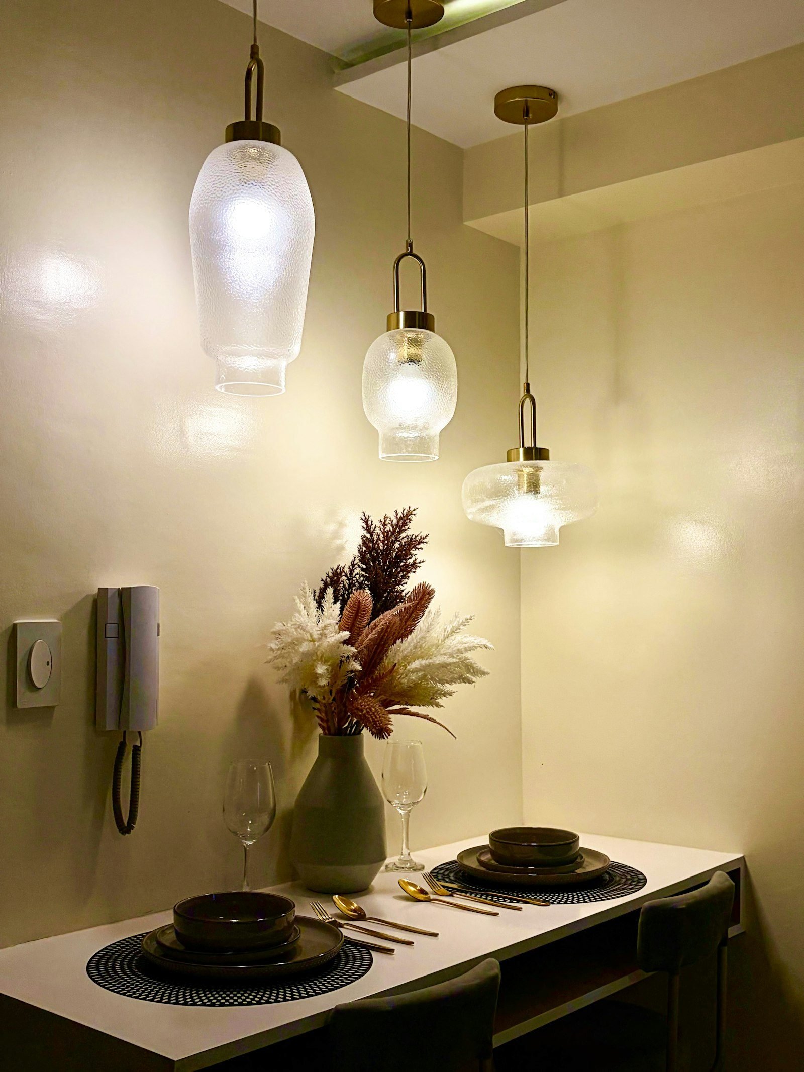
    The pendant over the table is the centerpiece. It should light the tabletop without glaring into the eyes of anyone seated, and the width of the fixture (or the group of pendants) should be in proportion to the size of the table. Warm, dimmable light flatters food and makes dinner more pleasant.

    Three glass pendant lights with a warm glow over a small dining table set against the wall
    Pendants hung at different heights create a focal point over the table. Photo: Remuel / Unsplash

    Kitchen

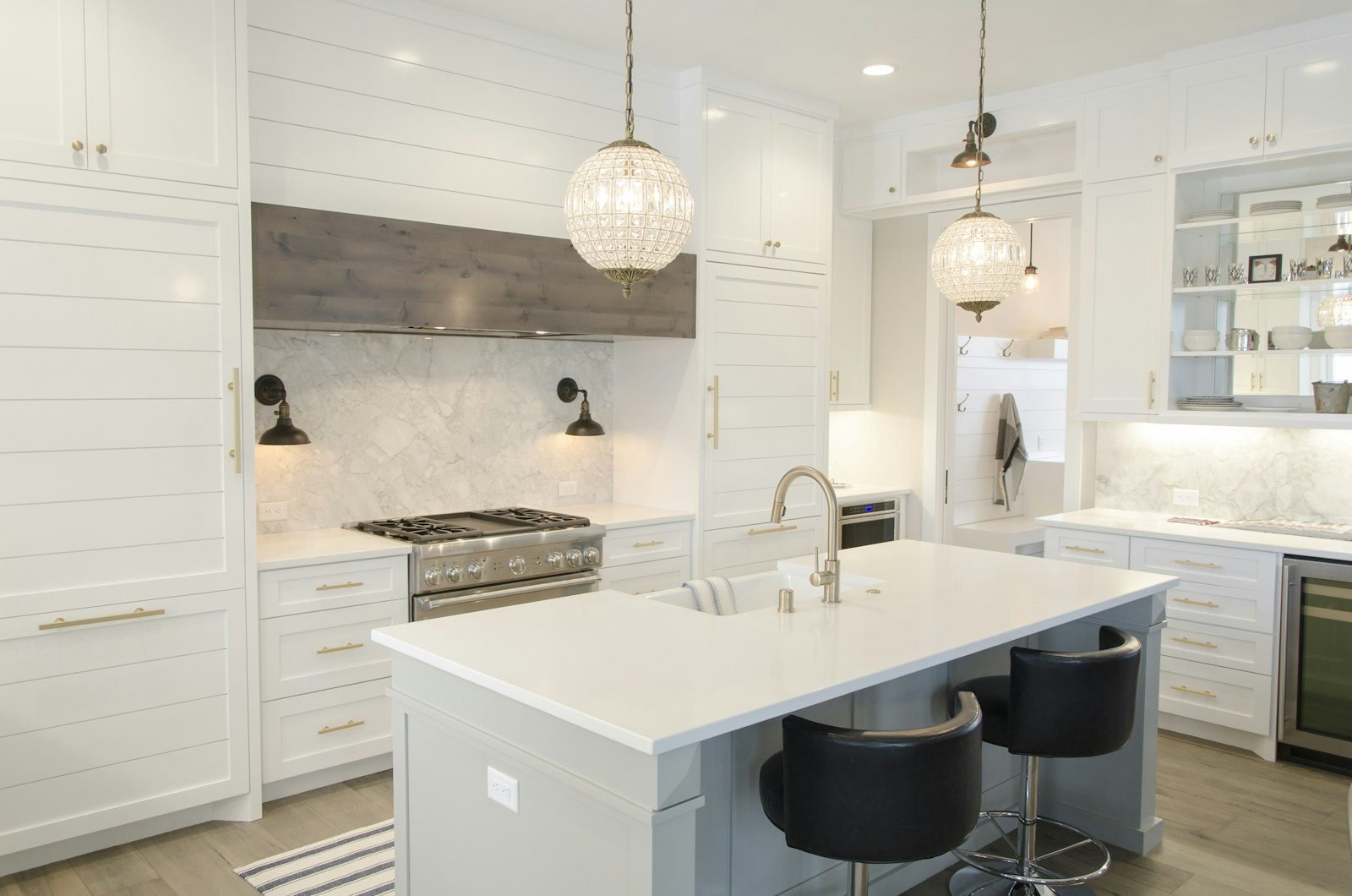
    Here, task lighting is essential. LED strips or channels under the upper cabinets light the countertop without your head casting a shadow, which is exactly what happens with a single central fixture behind you. Pendants over the island or breakfast bar complete the scheme. For more ideas for compact spaces, see our article on small kitchen ideas.

    White kitchen with crystal pendant lights over the island, recessed ceiling spotlights and under-cabinet lighting
    Recessed spots, pendants and under-cabinet lights: three layers working together. Photo: Aaron Huber / Unsplash

    Bedroom

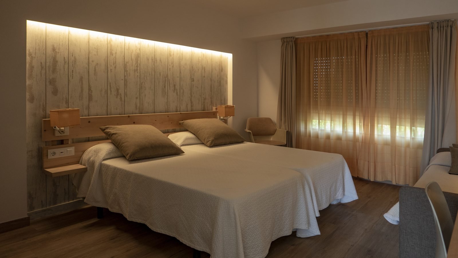
    Prioritize warm, indirect light. An LED strip behind the headboard or in a ceiling cove creates soft ambient light, and wall sconces or adjustable lamps take care of reading without disturbing a partner who wants to sleep. Three-way switches at the door and by the bed save you from getting up in the dark. Find more inspiration in our guide to master bedroom decorating ideas.

    Bedroom with an LED strip built in above a wooden headboard, reading lights and light-colored curtains
    Indirect light at the headboard and individual reading lights. Image: wirestock / Freepik

    Bathroom

    The most important spot is the mirror: light from the front or the sides illuminates your face evenly, while a spotlight directly overhead creates shadows under the eyes. Neutral light with a high CRI helps with makeup and shaving. In wet areas, use fixtures rated for damp or wet locations.

    Home office

    Pair good ambient light with a desk lamp placed on the side opposite your writing hand, and avoid glare on the screen. Neutral light, around 4000K, supports concentration. If you’re setting up a dedicated workspace, a lighting professional can help you size the light for the work area.

    Checklist for planning your home lighting

    • List the activities that happen in each room before choosing fixtures.
    • Plan at least two layers of light per room, on separate circuits.
    • Pick one color temperature per room and keep all the bulbs matching.
    • Compare bulbs by lumens, not by watts.
    • Choose a CRI of 80 or higher, and 90 or higher wherever color matters.
    • Make sure a bulb is dimmable before installing a dimmer.
    • Avoid light shining directly into people’s eyes, especially over the sofa, the bed and the dining table.
    • Follow local electrical codes and hire a licensed electrician for any change to your wiring.

    That last item deserves emphasis: new fixtures, coves and circuits require properly sized wiring and circuit protection, and mistakes can cause overloads or a risk of electric shock. And from a real estate perspective, well-planned lighting is also one of the details that adds the most appeal to a home during showings, because it makes rooms look larger and better finished.

    Frequently asked questions

    Do I need a professional to design my home lighting?

    For new builds and larger renovations, yes: architects and lighting designers integrate the light with the layout and the cabinetry. To swap bulbs or add lamps, you can apply the principles in this guide yourself. Any change to the electrical installation should always be left to a licensed electrician.

    What’s the best color temperature for a living room?

    For living rooms and TV rooms, warm light between 2700K and 3000K is usually the best choice, because it creates a cozy, relaxing atmosphere.

    Can I use cool white light at home?

    You can, but in specific areas such as the laundry room and the garage. In living rooms and bedrooms, cool light tends to make the space feel impersonal at night.

    What does CRI mean on a light bulb package?

    It stands for color rendering index, measured on a scale from 0 to 100. The closer to 100, the more natural colors look under that light.

    Conclusion

    Effective home lighting design comes from combining layers of light, a consistent color temperature and bulbs with good color rendering, always planned around the daily routine of the people who live there. Which room in your home needs new light the most? Tell us in the comments, and take a look at our guide to living room color ideas.

    Featured image: Photo: S.Group Official / Unsplash