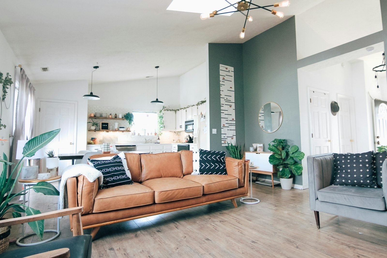
When you’re redecorating or moving, sorting through living room color ideas is often the step that causes the most second-guessing. The living room is the most visible space in the home: it’s where you welcome guests, unwind and, quite often, work or share meals. A well-chosen color makes the room feel warm and cohesive; the wrong one can start to wear on your eyes within a few weeks.
The good news: there’s no mystery to it. With a few simple principles, tried-and-true palettes and a proper test before you paint, you can get it right without relying on luck. In this guide, we’ve gathered combinations that work, smart moves for small living rooms and specific suggestions for the TV room.
How color changes the way a living room feels
Before thinking about trendy shades, it helps to understand the effect each color family has. Broadly speaking:
- Warm colors (terracotta, mustard, brick red, dusty rose) make surfaces feel closer and the space cozier. They work well in large living rooms or in rooms that feel a little flat.
- Cool colors (blues, greens, grayish lilacs) bring a sense of calm and seem to push the walls back, which helps in smaller spaces.
- Neutrals (off-white, sand, gray, greige, taupe) are the most versatile base and get along with almost any furniture or style.
Light changes everything. A living room that gets plenty of sun can handle deeper shades without feeling heavy, while a room with little natural light calls for light colors with a slightly warm undertone so it doesn’t look dull. Your light bulbs play a part too: warm, yellowish light brings out warm tones, while cool white light emphasizes blues and grays.
The 60-30-10 rule for building your palette
A proportion widely used by decorators helps balance the colors in a room. It isn’t a law, but it prevents excess:
- 60% — base color: walls, floor and a large rug. Usually a neutral or a soft shade.
- 30% — supporting color: the sofa, curtains, an accent wall or built-in cabinetry.
- 10% — accent color: throw pillows, artwork, vases, an armchair or a table lamp.
In practice, the rule helps you decide where your boldest color should go. If you love emerald green, for example, use it in the 30% (a sofa) or the 10% (pillows and accessories) and keep everything else calmer.
Living room color palettes and combinations
The table below lists six reliable combinations, with suggestions for where to use each color. Treat it as a starting point and adjust it to what you already own.
| Palette | Base (60%) | Supporting (30%) | Accent (10%) | Mood |
|---|---|---|---|---|
| Warm neutrals | Off-white or sand | Wood and caramel leather | Olive green | Welcoming and timeless |
| Green and terracotta | Soft white | Sage green | Terracotta and brass | Natural and airy |
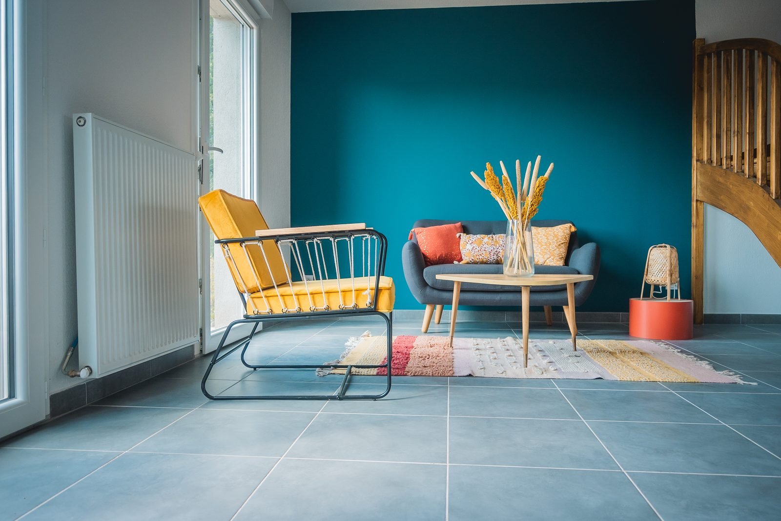
| Blue and yellow | Icy white | Deep teal | Mustard | Cheerful and bold |
| Gray and pink | Light gray | Dusty rose | Black and gold | Delicate and urban |
| Monochrome blue | Very pale blue | Mid blue | Navy blue | Serene and sophisticated |
| Deep earth tones | Pinkish beige | Coffee brown | Rust and natural linen | Intimate |
If you’d rather create your own palette, the color wheel is your best friend. There are three main approaches.
Analogous colors
These sit next to each other on the wheel, such as green, blue-green and blue, or yellow, orange and terracotta. The result is harmonious and restful, ideal if you want color without harsh contrast.
Complementary colors
These are opposites: blue and orange, green and pink, purple and yellow. They create energy and contrast. The secret is balance: one color dominates and the other shows up in small touches. Muted versions, such as deep teal with mustard, are easier to live with than pure, saturated ones.
Monochromatic palette
This approach uses a single color in several intensities. It’s an elegant choice that works especially well with varied textures (linen, velvet, wood, natural fibers) so the room doesn’t feel monotonous. To see how each palette relates to your furniture’s style, see our guide to interior design styles.
Colors for a small living room
In compact spaces, color is a tool for making the room look bigger. A few strategies that work:
- Choose light, slightly cool tones for the walls: icy white, pearl gray, soft aqua and grayish blue reflect more light.
- Paint the walls and ceiling the same color (or the ceiling one shade lighter): this blurs the edges and makes the ceiling look higher.
- Put the color in the furniture: a green or terracotta sofa adds personality without closing in the space.
- Avoid too many strong contrasts: walls broken up by several colors fragment the room and make it look smaller.
- Use a back wall: a mid-tone on the wall farthest from the entrance creates a sense of depth.
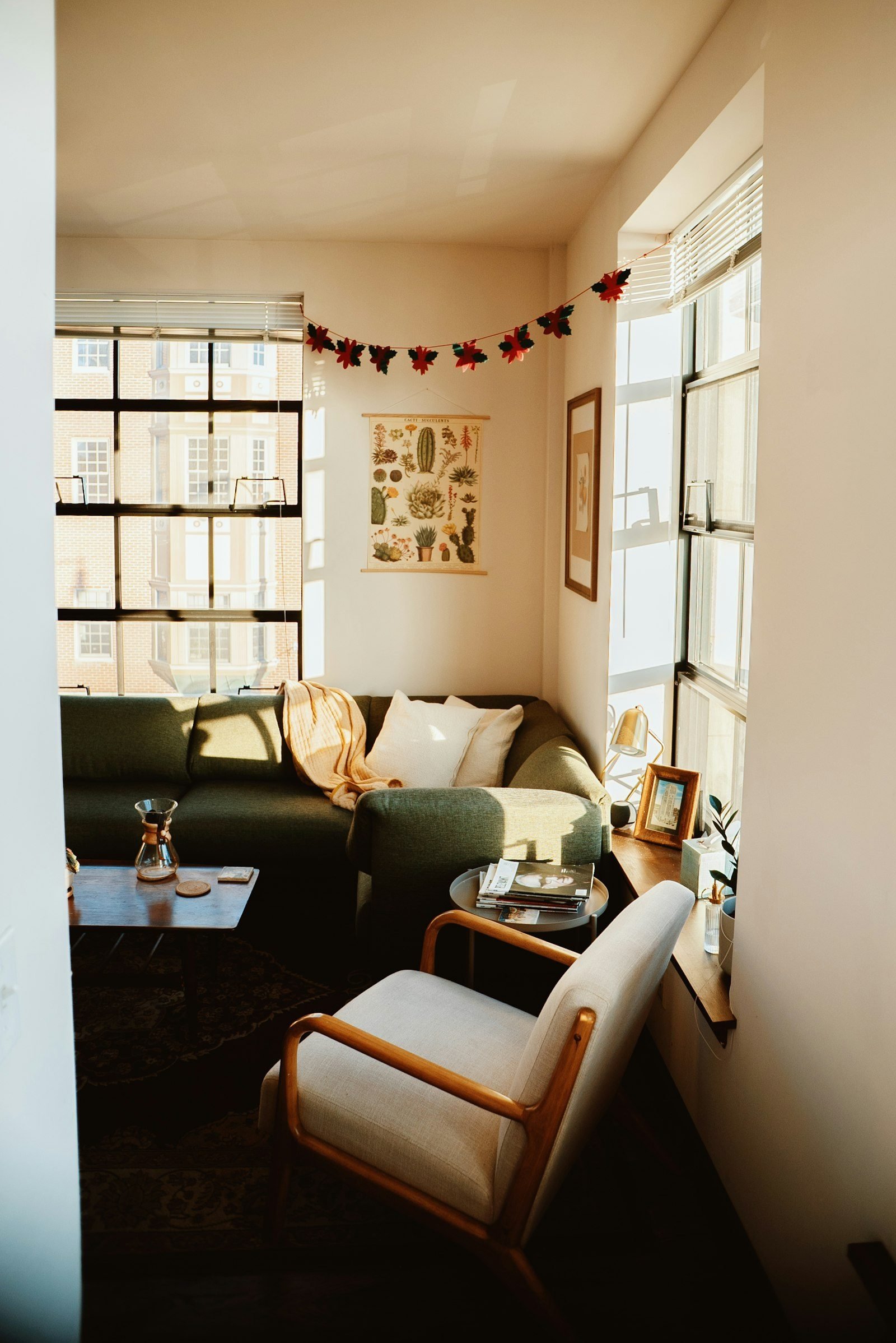
Dark colors aren’t off-limits in small living rooms. With good lighting, moss green or navy blue on every wall can create an enveloping, almost cocooning effect. What doesn’t work is a dark color in a room with no natural light and little artificial lighting. For layout and furniture tips, see our article on small living room ideas.
Colors for a TV room
When the living room is mainly used for watching movies and shows, the focus shifts: the goal is visual comfort and fewer distractions.
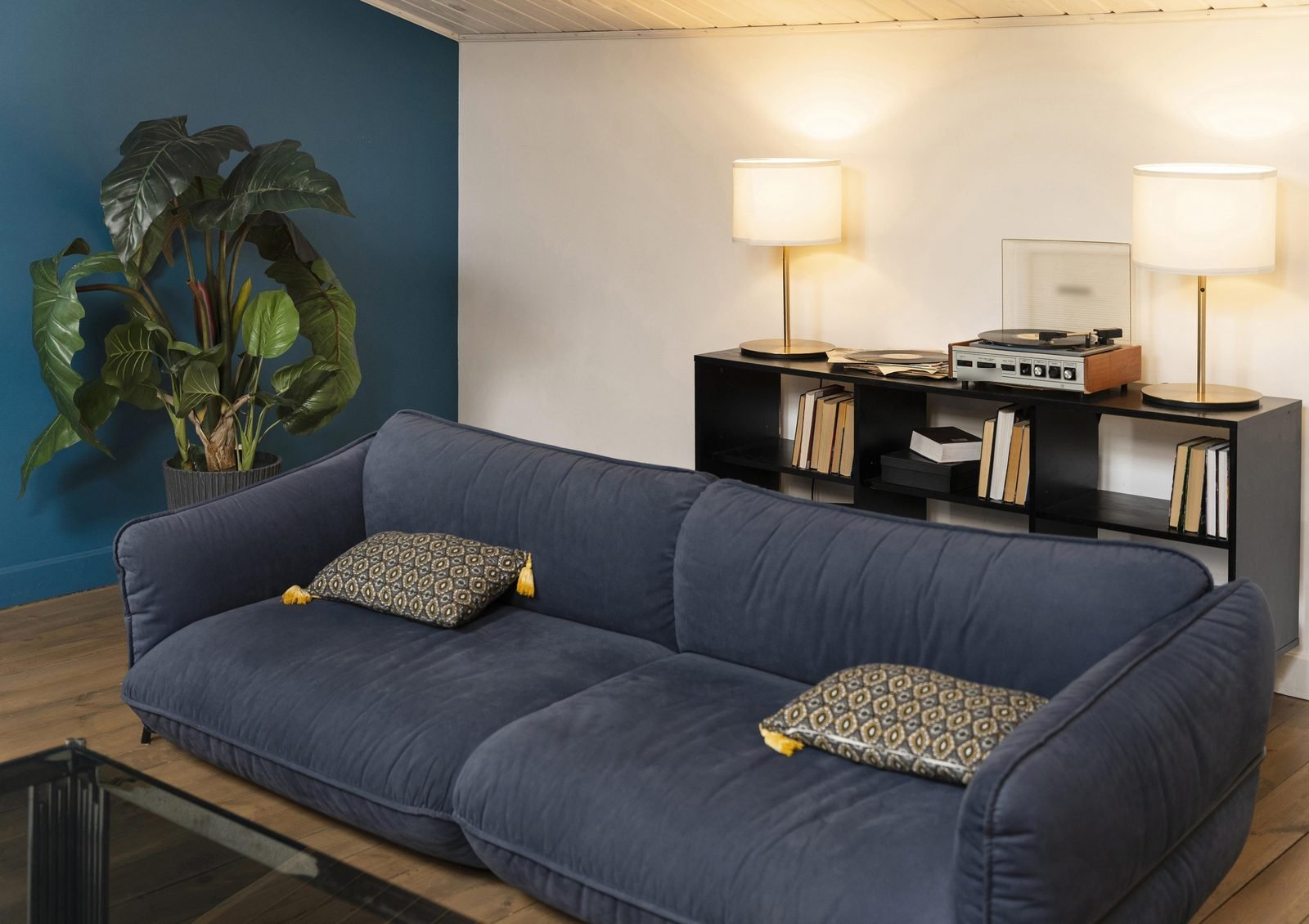
- A mid-tone or dark TV wall: charcoal, deep teal, moss green or brown help disguise the black screen when the TV is off and make the picture stand out.
- A matte finish: satin or glossy paints reflect light from lamps and windows toward the screen.
- Warm colors in the textiles: throws, pillows and rugs in caramel, burgundy or mustard balance cooler walls and make the room inviting.
- Wood paneling as an alternative: a slatted or flat wood panel adds color and texture without requiring dark paint.
Wall color works hand in hand with lighting. Indirect light behind or beside the TV and warm-toned bulbs make the room more comfortable at night. We cover this in detail in our guide to home lighting design.
Checklist: how to test a color before you paint
The same paint can look completely different in the brochure, at the store and on your wall. Before you buy gallons of it, run through this checklist:
- Paint large swatches (at least 8.5 x 11 in / 21 x 30 cm) or use peel-and-stick samples.
- Place the samples on different walls, including the one that gets the least light.
- Check them in the morning, afternoon and evening, under the bulbs you actually use.
- Compare the color with the floor, the sofa and your wood furniture, which won’t change.
- Choose the finish: matte hides imperfections; satin is easier to clean.
- Go for washable paint in homes with kids or pets.
- Calculate the wall area and buy a little extra from the same batch for touch-ups.
A note from someone who follows the real estate market: if you plan to sell or rent out your home in the next few years, a neutral base on the walls, with color in accessories and textiles, makes life easier. Visitors can picture their own furniture in the space, and repainting becomes optional rather than a must.
Frequently asked questions
What is the best color for a living room?
There’s no single answer, but warm neutrals such as off-white, sand and greige are the most versatile, because they go with almost any furniture and let you change the accent colors over time.
Can I use a dark color in a small living room?
Yes, as long as the room is well lit, whether by natural or artificial light. A safer alternative is to use the dark shade on a single wall or on the cabinetry and keep the rest light.
How many colors should I use in a living room?
Three main colors are usually enough: a base, a supporting color and an accent, following the 60-30-10 proportion. Shades of the same color and natural wood don’t count as extra colors.
What wall color goes with a gray sofa?
A gray sofa is wonderfully easygoing. It looks great with white or sand walls for a light feel, with sage green or grayish blue for a serene mood, and with terracotta or mustard accents to warm things up.
Conclusion
Turning living room color ideas into a finished room is more about method than talent: understand the room’s light, set the proportion between base, supporting and accent colors, and test before you paint. Which palette suits your home best? Tell us in the comments, and don’t miss our guide on how to find your interior design style.
Featured image: Photo: Kara Eads / Unsplash